There’s Beauty In Simplicity
By Martin Toney
[divider]Today in gaming we are living in the 8th generation of video game consoles, and as each of these generations comes and goes the main stream gaming audience is introduced to increasingly more powerful video game platforms. It’s an easy thing to understand that as more powerful gaming platforms are introduced to the masses, that a certain level of graphical fidelity is to expected. As gaming has grown, so to has the community of people who associate themselves with it. The gaming community has gone through many different stages of development in its long and varied life. From enthusiasts, purists, supports and casual fans all the way up to becoming game developers, mod creators and many other jobs that are unique to gaming. It’s this diverse community that keeps gaming (at its core) about the games and how fun they are.
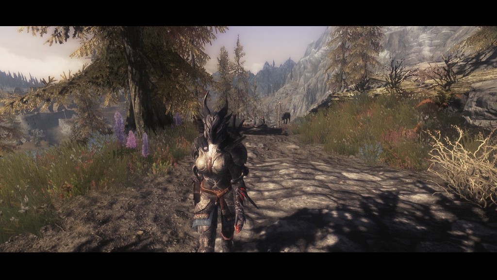
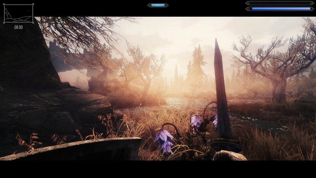
But recently, games have become more about having impressive graphics and the highest possible polygonal count. The heart and soul of a game is the gameplay. Now, don’t get me wrong. A fantastic game can look very impressive if given enough time and care, take the recent Bioshock games, Tomb Raider’s reboot and Naughty Dogs The Last of Us. If you take time to refine gameplay and game feel then you can certainly make a game look stunning as well. If you don’t take the time to do that you end up with something along the lines of CI Games “Alien Rage”. Sure it looks nice, but it’s boring, buggy and repetitious. But to hammer home my point, it’s the community that really steps up in times of need. Remember The Elder Scrolls V: Skyrim? Of course you! That game was incredible! And it still is…but it has aged like milk. So the community stepped up to the plate and created a series of mods that increase the games gameplay, game feel, graphics and over all playability. And I’ve provided a couple of screenshots from my personally modded Skyrim: well you can see the results yourself. It’s beautiful now, whereas it was once blocky and unpleasant.
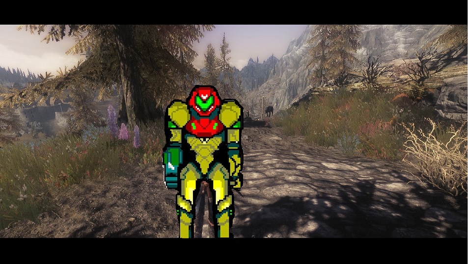
But there’s beauty in simplicity. Remember the golden age of gaming? Hark back to the days when your games where terribly basic and all you had to do was reach a goal at the end of a stage. You didn’t need to worry about your frame rate, polygonal count was a thing you had never heard of and particle effects was a term that hadn’t even been created. All you had was a sprite in a game world and a goal. Consider if you will, The Legend of Zelda (1986) for the Nintendo Entertainment System. That game looks like it was made out of Lego! And to be quite frank, it’s so basic you may well be able to rebuild the entire cast of the game with Lego. But that didn’t matter, because Link was on a journey and it was up to you to discover where to go, what to do, how to fight the enemies and save the day. All this was completed with a game world that was a tiny 16 tiles wide by 14 tiles high, each tile consisted of 16 pixels by 16 pixels and Link could only move one pixel at a time. To this day that game is praised for it’s simple yet deep gameplay, basic but endearing art style and the fact that it is still being played today as a speed running classic challenge. But that’s all in the past. Sure, there are plenty of games nowadays that use pixel art but there’s so many of them that they’re a dime a dozen. Pixel art is no longer a creative sub culture, it’s more or less fuel for the mediocre indie fire and anyone can supply it. Here’s some proof. Remember Metroid and how amazing it was? Well I just made one of gamings most iconic characters in under 10 minutes in MS paint.
But fret not my friends. The Golden age isn’t over yet and there are people out there that won’t let it go away without a fight. I would like you all to meet Shovel Knight. A little blue armour clad knight wielding a mighty sharpened shovel that’s out on a quest “to defeat the evil Enchantress and save his lost beloved.”
 Is the premise silly? Sure it is. It’s a blue knight swinging a shovel and digging for treasure. But where Shovel Knight differs from most other pixel art games, it draws inspiration specifically from the NES era. And more importantly, it’s heavily influenced by the classics such as Castlevania III Dracula’s Curse, Super Mario Bros. 3 and the various games found in the 8-bit Mega Man series. What this game is doing at the minute may well spawn a new genre of gaming that I would call “Remembrance Gaming”, a game style that looks back at the time when games were about the fun and the gameplay, they didn’t require massive sand box worlds or hyper realistic lighting and god rays. The beautiful 8-bit graphical style mixed with modern day graphical techniques like parallax scrolling (the image in the background scrolls at a slower pace than that of the image in the foreground, lending the overall image a sense of depth despite its 2D nature) allows us to bring the old mechanics and aesthetics of a bygone era to the front of gaming once again, where it belongs.
I’ve already said that pixel art is nothing special, just look at Terraria, Dig-N-Rig and Edge of Space. They all use pixel art, and they all look the same. And when everything starts to look the same, it starts to get boring. Regardless of how innovative it is.
Shovel Knight is different because it intentionally limits itself. Rather than allow themselves to use any colour palette they want, the developers “Yacht Club Games” have restricted themselves to using only the NES colour palette.
This means they have a small range of colours to actually use, but that can sometimes be beneficial. When you have all the colours that you can possibly think at your disposal, then you can create any kind of feeling that you want in the game. But a limited palette means you need to use complimenting colours from within the limited palette you’ve chosen. To give you a better idea of what I’m saying, Arin Hanson perhaps put it better in his popular video series, “Sequelitis” when he talks about colours and their compliments.
“Okay, I don’t know about you but the first thing that struck me about Simons Quest when I first started it up, was how boring Simon looked…it makes me wanna fall asleep. Whoa, look at that orange! In Castlevania 1 he popped out! BAZAM! All the level palettes incorporated orange in some way, and often incorporated shades of blue. Which is oranges compliment. AKA, it makes orange ‘pop out’. It made everything pop in general and the game felt, alive!..”
Arin Hanson [Egoraptor] Sequelitis – Castlevania 1 Vs Castlevania 2. March 11 2011. Speaking about Castlevania 1 (seen left) and Castlevania 2: Simon’s Quest(seen right).
The point I’m making in case you’ve missed it, is that when you can use every colour that exists, then things tend to look bright and colourful but ultimately a little soulless. When you look at the artwork of Shovel Knight it looks somewhat singular in the swirling vortex of indie pixel art games specifically because it uses what was available during the pixel art heydey of the 8-bit and 16-bit rule. I suppose that if you’re to take anything away from this article, it’s that all games have the capacity to be good. And if you can make a great game look good, then by all means do so. But just remember, even if you’re using the most powerful engine available and rendering the most beautiful vistas ever conceived. Your game will ultimately perish if your core concepts aren’t refined and sturdy. Always keep in mind that there’s beauty in simplicity.
[divider]As an editorial, the views expressed in this piece are those of the author, and not necessarily the views of Cliqist.com or its staff.


