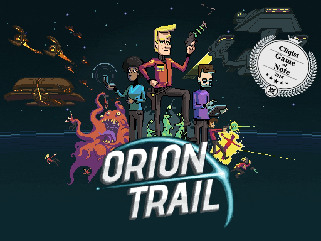
If you’ve played Orion Trail, you’ll know that it’s kind of a weird game. Warp Weasels, Spacesquatches, gasoline powered spaceships – you name it, and we’ve probably got it. Or, at least an approximated (or misunderstood) version of it.
It seems fitting that the journey we took to develop Orion Trail from a concept to the finished product is equally weird. In this article, I’ll be detailing a short history of how Orion Trail came into being, followed by the road Schell Games took to get our original prototype to Kickstarter.
Spacedate: Incredibly Late 2013 – The Prologue
Long before the concept of Orion Trail was even a twinkle in our eyes, a small group of us were working on a prototype for a completely different game: a top-down, arcade-y space shooter.
Games like Escape Velocity and Freelancer were hugely influential for me as a kid. The sense of freedom you had while playing these games was awesome. Space battles! Negotiations! Asteroid mining! Trading! Whatever floats your spaceboat, man. You’re the super-cool space captain.
I had pitched the idea of prototyping something that was pretty faithful to one of those games to Evan Brown (the eventual Art Director for Orion Trail) and Patrick Jalbert (a fellow designer here at Schell Games). They were sold on the idea, so we got to work on our little side project.
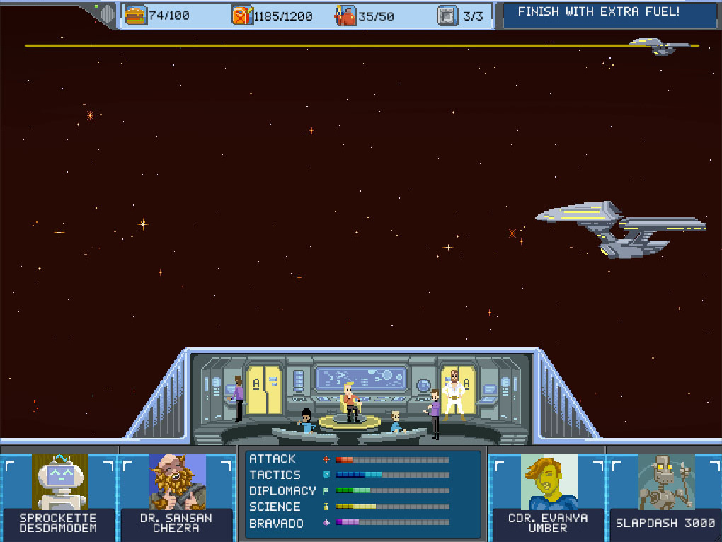
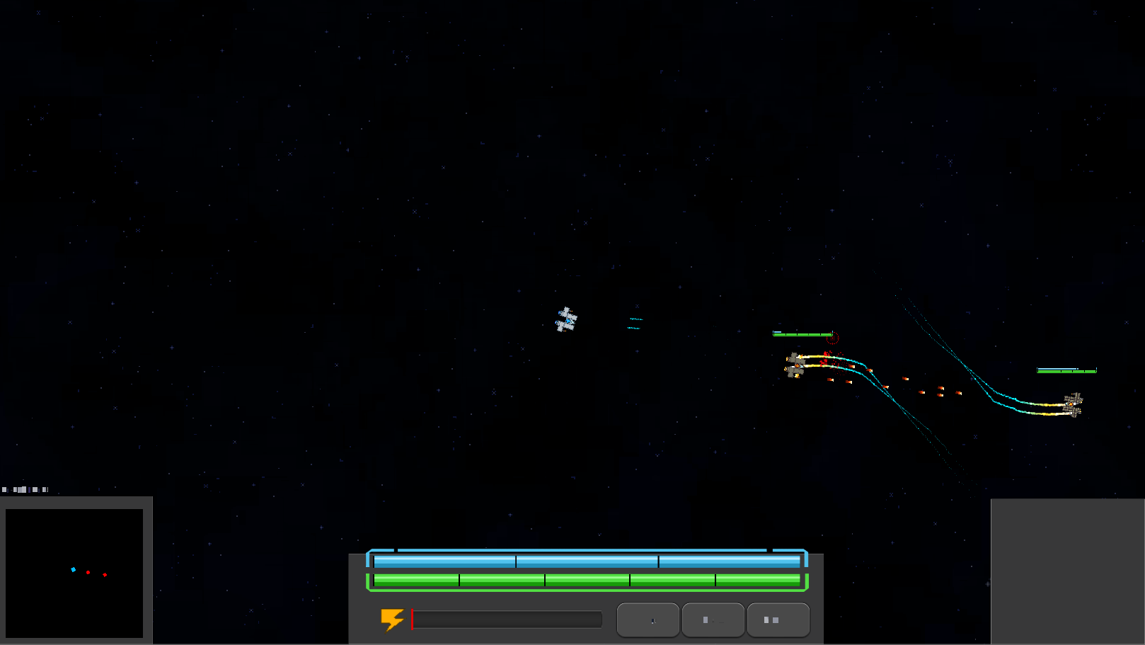 We were already aware of Captain Forever (the super-excellent CF: Remix wouldn’t be announced for another six months), so in order to differentiate our prototype, we were hoping to have a larger focus on your individual crew members. We were trying out various ways to do that (minigames, dialogue trees and the like), but there was one mockup that Evan threw together that got us all excited.

The idea was that this little bridge view would show the crew reacting to the combat happening in the arcade-y shooter game, classic Star Trek style. Alarms! Crew members bracing themselves!
Exploding consoles! This was all kind of scopey, of course, but it got us really excited.
Spacedate: October, 2014 – Jam Week
Nearly eight months passed since we had stopped working on our side project. At this time, Schell Games was holding its annual “Jam Week.”
Basically, for one week each year, everyone at the company pauses work on their current projects (barring any sort of catastrophic, on-fire situation, of course) to spend a week to either learn new tools and techniques, or form a small team to create a prototype for a game idea that they’re excited about. Enemy Mind, one of our other games, originally started off as a Jam Week prototype.
The few ideas I was toying with were way too complicated for the scope of a weeklong prototype, so to look for inspiration, I went back through some old designs that never really saw the light of day.
And there it was, staring at me in the face.

Instantly, I was once again excited about super cool space captains and sci-fi spaceship stuff. Looking through some of the docs we had written, though, it was quickly clear that the original designs were out of scope for a weeklong prototype. However, I was hellbent on bringing the above image to life somehow.
I approached Evan, and we tried to tease out what was making us so excited about this (admittedly, adorable looking) mockup. After some discussion, we concluded that it was a deeply borne nostalgia for classic science fiction shows like Star Trek.
As the audience, we were always looking on as the Captain made tough decisions involving weird, stupid or terrifying space phenomena that you could never imagine. Then, the audience would watch the events unfold, and everyone else on the bridge would either look around dramatically, or hang on for dear life as the camera gently shook.
Okay, so the crazy situations and the romanticized burden of command from those classic shows were important to us. If we wanted to turn those feelings into a game, then, what would be the best way to do that? What genres work well to tell weird stories?
Around this time, I had been extolling the virtues of an old XBox Live Indie Game Super Amazing Wagon Adventure. SAWA is basically a hyperactive, misremembered retelling of the classic game Oregon Trail where all you did was shoot oncoming animals, bandits, and…other stuff. I don’t want to spoil it. Seriously, check it out.
I bring this up because I’m pretty certain that SAWA was the reason I suggested making a sci-fi version of Oregon Trail. Even without thinking it through the whole way, it made a lot of sense: it has a small, core game that is quick to prototype, and in time we could create lots of crazy situations to increase the content pool.
So, we pitched the game to our co-workers to see who wanted to help…and we got a whole bunch of people excited about the concept (you’ll see ‘em in the credits). We also did a little paper prototyping before Jam Week, which only got us more excited. We were ready for Jam Week.
After lots of quick iterations, space jokes, and hard work from the Jam Week team, the original prototype was finished. You can actually still download it from GameJolt if you’d like to check it out.
The game was a hit internally, and almost immediately schemes were hatching for where to go next with it.
Spacedate: December, 2014 – Steam Greenlight
We had the demo, and we had an idea of how we wanted to expand it, but we weren’t sure whether there was any kind of demand for this style of game. After several discussions within the studio, we still weren’t sure if we were ready to commit the resources to making and running a Kickstarter.
So, we decided to put it on Steam Greenlight as a way to test the waters. In our minds, it was like a pre-Kickstarter to gauge general interest. So, after about a week of throwing the page together, we posted it!
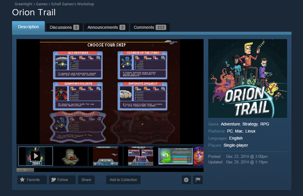
Within a few days, we were successfully greenlit. Admittedly, it’s a lot easier for someone to say “yes I think this is a cool idea” instead of “yes I will give you money for this idea,” but the speed in which we were greenlit gave us hope that there was a real audience for Orion Trail.
Now we had to start planning the Kickstarter.
Spacedate: Late January, 2015 – Planning the Kickstarter
This next section is gonna be pretty long, so get ready for a lot of words. In the interest of readability, I’m going to break it out into three sub-sections, starting with the research that went into our campaign.
Part 1 – Kickstarter Research
For those of you unfamiliar with Schell Games, we had already run a successful Kickstarter for Puzzle Clubhouse back in late 2011. Things on Kickstarter had changed pretty dramatically since then, so we basically felt like we were starting from scratch in terms of planning and research.
In our minds, looking at what other contemporary Kickstarters were doing (video, page layout, reward tiers, frequency of updates) was crucial for our campaign. If we didn’t look as professional as other Kickstarter campaigns, we wouldn’t get (and didn’t deserve) a backer’s money. In a sense, they were our competition, regardless of genre or scope.
Also, since we were planning to fund the entirety of Orion Trail through Kickstarter, we needed to plan our feature set and game size accordingly. The prototype gave us a good starting point, and while we wanted to add, like, a million things to it, we had to be pretty strict with ourselves.
Thus, our goals were:
- Determine what a reasonable asking price for a game like Orion Trail is.
- Find out what contemporary Kickstarters look like in terms of layout.
- Find out what contemporary Kickstarter reward tiers look like.
- Create a budget for Orion Trail that we believe in.
With those in mind, we started our research. Around this time, Kickstarter had posted a very useful set of statistics for projects that launched in 2014 which we relied upon heavily in our own research. We also made sure to look up contemporary Kickstarters that were a) similar to our own game and b) of similar scope.
The important takeaways we found were:
- 45% of Games projects raised less than $10k.
- 46% of Games projects raised between $10k and $100k.
- 9% raised $100k.
- On average, a game project in 2014 raised $38,500, compared to $71,300 in 2013.
- Nearly 30-40% of backers will pledge at the lowest tier that comes with the game.
These takeaways felt like a pretty good framework to start with. We all had wild hopes and dreams for how to expand upon the prototype, but the “9% raised $100k or more” statistic gave us a ceiling in terms of budget. Because we were feeling cautious, we decided that it would be prudent to keep our budget under $90k.
Part 2 – Budgeting the Game
With those numbers in mind, we started estimating the amount of work each feature would cost in terms of development time. This included things like game content (encounters, mini games, the animations for the bridge), and tools for us to actually make the game. Obviously, some features were more important than others, but at this point we just wanted to get them all on paper.
Nearly every feature (and secret dream) was given a price tag, and then prioritized based on how crucial it was to ship a game we believed in. Anything that caused us to go over the $90k pricetag was either scaled back (50 encounters vs. 150, fewer character animations), or it was put aside as a potential stretch goal for the campaign.
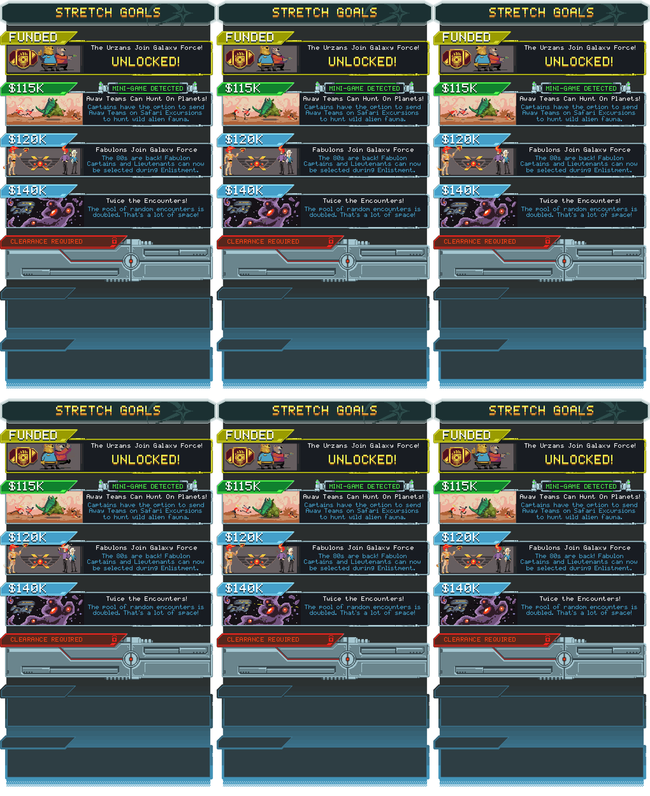
Now, I wanna be clear that when we were creating our list of stretch goals, we wanted to make sure that in the event we didn’t reach ANY of our stretch goals, Orion Trail would still be a fun game that we were proud of. We were only able to hit our first stretch goal (adorable bear people added to our crew), so I’m glad we took this precaution.
That said, the one feature that was hotly debated until the very end was hunting. When you think of Oregon Trail, the most vivid memory many of us who played it had was shooting at pixelated buffalo until you went cross-eyed. So, it seems obvious that we should be including that in Orion Trail, right?
Unfortunately, after doing our estimates, adding a hunting mini-game (that wasn’t poorly made) pushed us over the dreaded $100k mark. After many heated discussions, we weren’t convinced that the need for the minigame outweighed risk of not getting funded and believed that the gameplay we had in the prototype was more than enough to still be fun.
Whether that was the right call or not, we ended up cutting it and put it as our second stretch goal.
Part 3 – Making the Actual Page and Reward Tiers
So, with all the budgeting and stretch goals out of the way, we got to work setting up the rest of the page and reward tiers. Looking at other contemporary Kickstarters was helpful here, as it helped us see what did and didn’t work. You can check out our Kickstarter page here.
I won’t get into too many details about which Kickstarters we were looking at, but here’s a “short” list of stuff we kept in mind while crafting our page:
- If people can’t figure out what your game is within, like, a minute of getting to your Kickstarter page, you’ll probably lose them. This goes for both your video and your description.
- The first thing on your page should be a brief, but compelling description of your game.
- When describing the game and its systems, be as short and to the point as possible. Don’t bog it down with overly detailed descriptions of your game’s world.
- If you have a playable version of your game that doesn’t misrepresent the eventual end product, share it! It’s a lot easier for people to understand your idea by playing it.
- While scrolling down the page, you should always either be seeing an image on the screen, or have one at the bottom to keep drawing the eye downward.
- Gifs are awesome, but be careful of how many you’re using and how big they are. Having to wait and load the super cool images that are meant to entice is no good.
- Reward tier graphics should be easily expandable and readable, as you might add stuff in the middle of the campaign. (We did)
- Keep in mind that you can’t search for text in images. Having a lot of text in an image will look good, but it could be a little frustrating if someone is looking for a specific thing. (We were guilty of this)
- If you don’t introduce yourselves in the video (we didn’t), be sure to do it somewhere on your page. People like to know you’re a real human.
For our Kickstarter video, we wanted to show a high level look at the art and the tone of the game as quickly as possible. Watching someone play the prototype as a video wasn’t the most exciting way to do this, so we edited both new and existing art assets together to meet our intended goals for the video.
If you watch the video, you’ll notice we didn’t include a section introducing the team. We decided against this because we weren’t convinced it was totally necessary. People could read about us further down the page, and we didn’t want an amateurish looking “interview” with the devs to undercut the game.
For the reward tiers, we were aware of the fact that a majority of our backers would back us at the lowest possible level to get the game. So, we wanted to make sure that we had enough cool stuff to offer to get people interested in a higher tier.
Due to cost concerns, we initially focused on only offering high-value, non-physical rewards that didn’t blow out our game scope. This included stuff like adding your name as a randomly generated Redshirt character, or turning your likeness (based on a photo) into a Captain, Officer, or Villain within the world.
In the end, though, we felt like it was really weird to not offer ANY physical goodies, so we did the cost estimates for printing shirts. Later on, crafty studio members donated some lovely, hand-made Warp Weasels to offer to high-end backers, along with cross-stitches of some characters. They’re adorable.
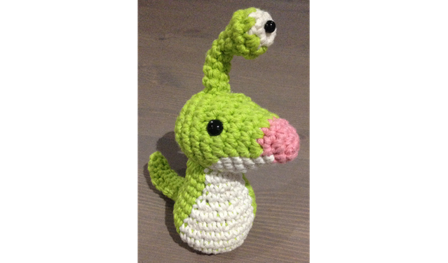
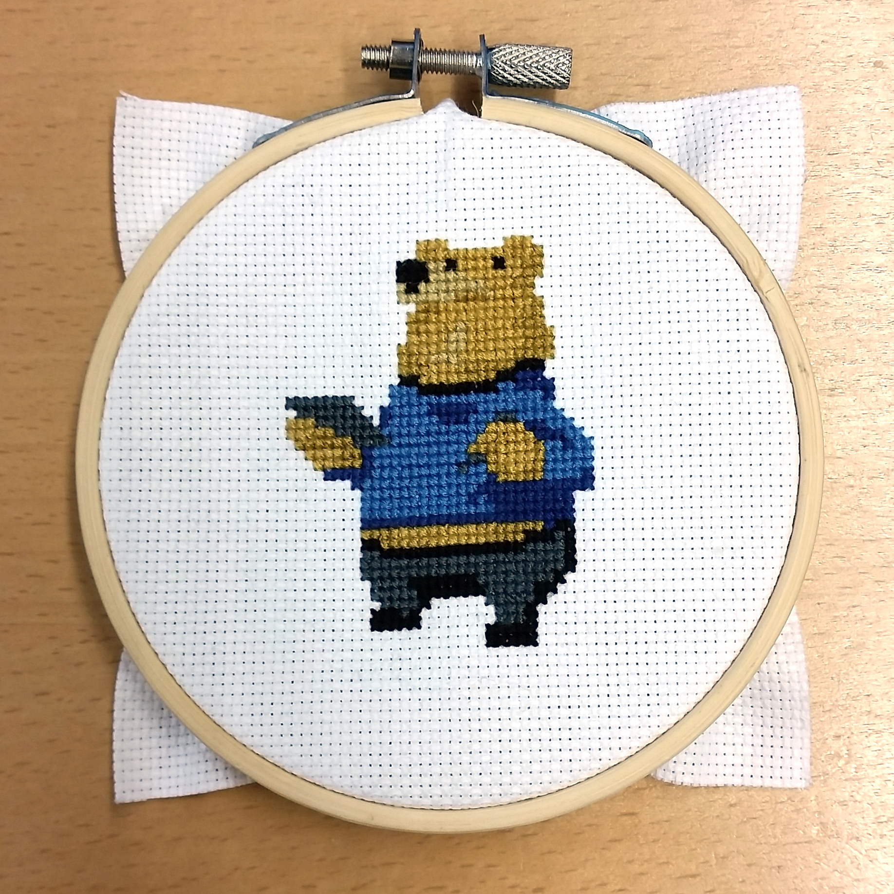
With all that done, we then spent countless hours poring over every little detail, making sure everything was nice and ready for the public.
Spacedate: February, 2015 – Kickstarter Launches
So, once we pushed the “GO” button, everything was kind of a blur for me since I was the point person for basically everything related to the Kickstarter. It was on me to respond to any questions, comments, and in general be the guy in charge of keeping everyone hyped about the project.
Because I can’t think of a better way to organize the loose collections of thoughts, fun facts, and other oddities that happened during the campaign, I’m just going to list them out in no particular order. Okay? Okay.
- Priming the pump before a Kickstarter launches is pretty crucial. We didn’t do enough of it, so there was kind of a scramble to get people excited about the launch of the project. This should ideally be done a month (or more) ahead of your actual campaign launch.
- We posted at least 3 times a week on a Monday, Wednesday, Friday schedule to keep everyone in a rhythm. Updating every day felt excessive, especially if there was really no news.
- We tried to get the prototype posted everywhere we could. It was a great way to get people to the campaign.
- Post about your project constantly. Be shameless. People will let you know when they’ve heard enough.
- Make sure whoever is in charge of the campaign has the authority to make on-the-fly calls. Kickstarter moves quickly enough that any amount of bureaucracy can be too slow.
- We added several reward tiers during the campaign, and the way we wrote our earlier tiers caused confusion later on. Be prepared for this!
- Cross-promotions and crossovers are cool! We had the privilege of getting shoutouts from awesome projects like Starr Mazer, Moonman, Crowfall, and Toejam & Earl. We reciprocated, of course.
- Our campaign overlapped both GDC and PAX East, but we had no real representation at either event. Unfortunately these weeks were the worst weeks of our campaign.
- News sites don’t care about your Kickstarter! At least, it’s very hard to get their attention. It also didn’t help that, around the time we launched, news about Godus seemed to sour people on Kickstarter.
- Everyone tells you the middle slump of a Kickstarter campaign is going to be rough, but nothing can really prepare you for it. Seriously, it’s a real drag.
- We managed to earn nearly 40% of our funds in the last week, which, at the time, seemed wholly unlikely. People talk about the big final push, but ours seemed pretty extreme.
- Setting up Google Analytics is really, really helpful for figuring out where the heck people came from. Kickstarter’s analytics are decent, but we got a lot of traffic that we couldn’t track.
Whew. It was a pretty crazy ride, and I’m sure I’m forgetting some stuff. But, hopefully some of these details will be helpful to anyone preparing for their own crowdfunding campaign.
Launch and Beyond
Orion Trail entered Steam Early Access in late August 2015, and we then later launched in late October of the same year. Since then, at the time of writing, we’ve had two major updates addressing player feedback, and have a third (free) content update coming out in mid to late December. You can download the game from Steam or itch.io.
We’re also working on a version of Orion Trail for the Samsung Gear VR. I’m serious. Take a look:
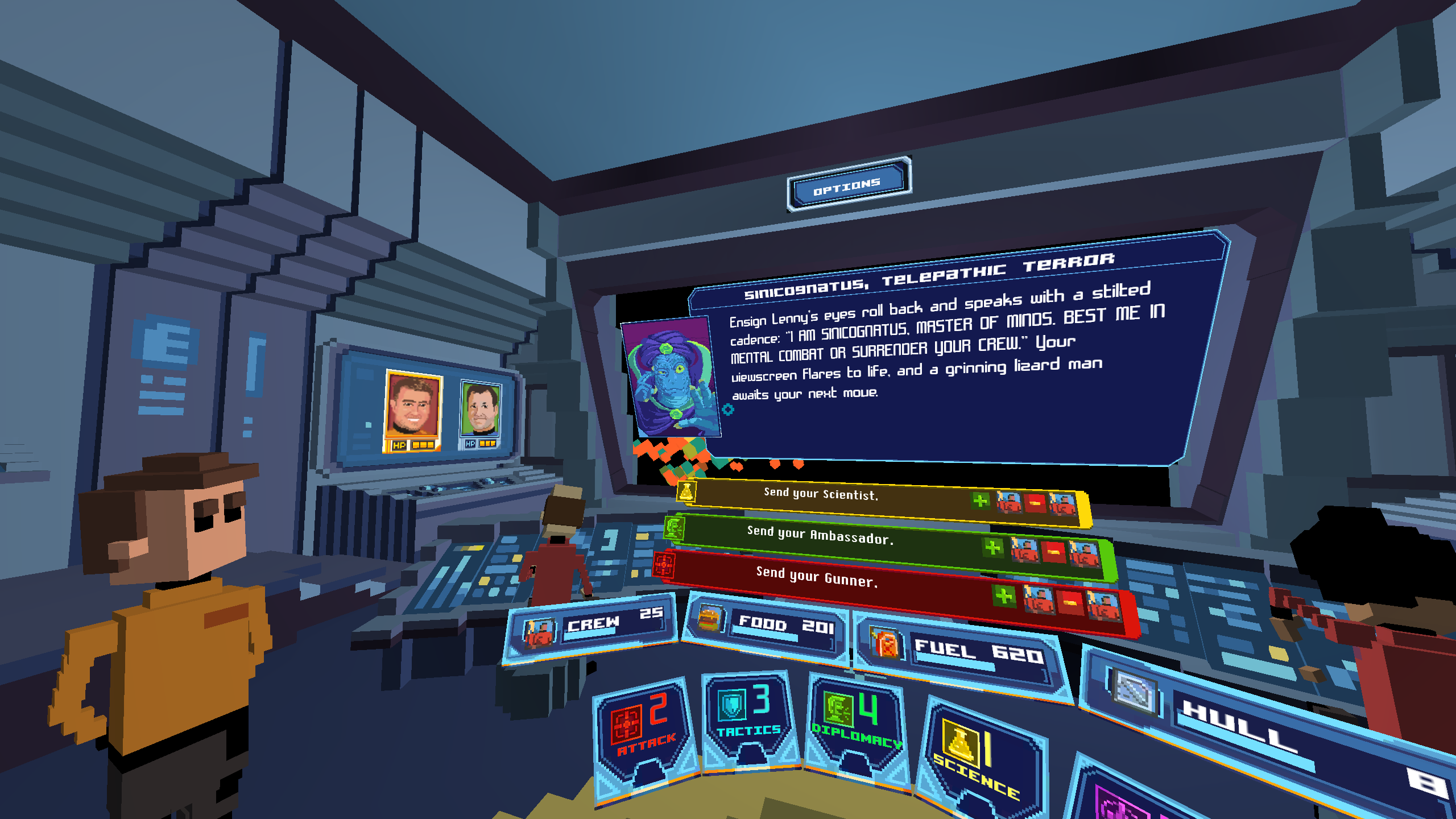
It’s the same core gameplay, but we’ve adapted the interface and the characters to be awesome in a VR headset. We’re excited for people to get their hands on it December 24th via the Oculus Store.
Thanks for joining me on this long, windy journey through Orion Trail’s history. If you want to ask me questions or tell me about your own Kickstarter experience, reach me on Twitter at @davebbennett or via email at dbennett@schellgames.com.
Orion Trail is a Cliqist Game of Note, be sure to check out the rest of our Orion Trail coverage right here.
