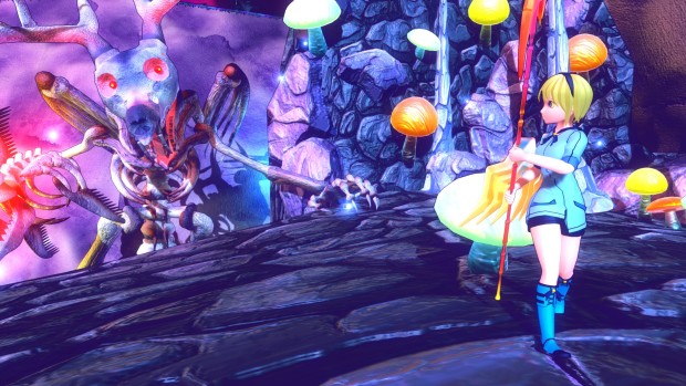
Developer, From Soy Sauce, originally created Glass Wing as an entry for a month long game jam held by 64 Digits. Over the course of one month FSS was able to create a retro inspired 3D platformer that played like an intriguing mashup of a N64-era RPG’s. Now, FSS has created an Indiegogo campaign seeking $10,000 to fund an updated version, Glass Wing Retold. Unfortunately, the plan doesn’t give enough details to hook anyone new to the game.
Glass Wing Retold puts players in the role of Mayfly, a pixie-like creature lost in a dangerous world with zero combat abilities. Too physically weak to fight, Mayfly instead must rely on acrobatics, stealth, and puzzle solving to evade monsters.
While I can understand the desire for the developer to go back and spend more time crafting the characters and world, the campaign doesn’t give many hints about what improvements they are seeking to make. The reworked graphics aren’t necessarily better, surprisingly. The main antagonist, Ferace, is the only clear improvement over the original version. Meanwhile, the backgrounds and environments actually suffer a bit because of the new style.
Trying to piece together a story
Glass Wing’s director, Sayuri Naggata explains on the campaign page that the decision to remake the game came from a desire to flesh out the narrative. “Fans of the original wanted to know more about the Glass Wing world as well as Mayfly and Ferace as characters. Since I saw no where to go with Mayfly after her growth of a character at the end of her adventure, I felt it best to make a more detailed telling of the story.”
Fair enough, but the campaign doesn’t outline the updated story or game mechanics. Certainly not enough to justify asking $10,000 for a revamped version. Glass Wing Retold centers around puzzles and platforming, but even those aren’t detailed or explained on the page. It’s a bit disappointing really, as there is certainly a market for this type of game, but the campaign is simply too ambiguous and muddled to find it.


Thank you for the feedback, I will see what I can do to gather a more focused detail.
Updated, happy now?
Hi, I went and took another look at your campaign. The additional information is great, but it’s still not presented in a particularly cohesive manner. It reads as if things were added as you thought of them rather than as a clearly presented marketing document, which is basically what a campaign is when you’re seeking funding.
As for my criticism of the graphics, a lot of that is personal preference, but I thought the simpler graphics from the first version worked better for a platformer and that the newer ones, while textured better, come off as a bit murky and overdone. I didn’t have any particular problem with Mayfly, I just felt that the redesign for Ferace was much more obvious and added more to the character. Think of it like this, Mayfly got a reskin, Ferace looks like a completely new character.