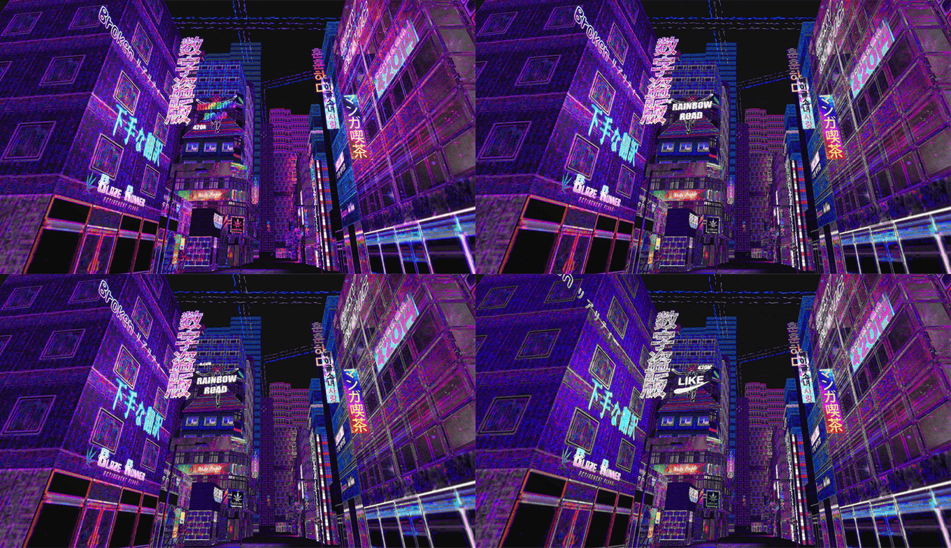
Broken Reality is a game that sells itself on weirdness. It’s not the, “America is letting a racist tangerine run for president” kind of weird. It’s more of the, “look at these brightly colored objects floating in nothingness” style of weird. Perhaps weird isn’t even accurate here; it’s abstract and more than a little obtuse. All the Kickstarter page has to say for itself is that it’s, “A first person Adventure Game about our lives on the internet set on a psychedelic world.”
There’s also a demo coming in 2017, so that’s something to look forward to! Except, you can’t. Raising only $8,416 of its $35,000 goal, it’s doubtful Broken Reality will become a reality as soon as it could have had the campaign succeeded. So why did the campaign break as badly as my attempts to shoehorn “break” into this sentence?
Because of the very same weirdness that was driving the campaign.
When Weird Is Too Weird
Kickstarter enables developers to produce games they normally couldn’t through the traditional publisher route. At least, that’s the typical line developers feed us. In theory, it’s true. Some pretty bizarre and groundbreaking games are funded, like Superhot and Undertale. However, for every one of them, there are at least half a dozen “spiritual successors” or sequels making the majority of cash on Kickstarter.
The fact of the matter is, the average backer is just as risk averse as a high value publisher. Nobody wants to fork over $500 or even $10 on a gamble they don’t understand. That’s where we find ourselves with Broken Reality. There’s nothing understandable about this confusing, abstract, weird little adventure game.
The beginning paragraph gets off to a solid start. It explains that the game is a first person, 3D adventure set on the internet. Perhaps that’s another reason for this game’s failure – do you want to walk around in a virtual representation of the internet? But from there, the text devolves to be as meaningless and lacking in context as the multitude of screenshots, gifs, and videos.
“In it you will explore a network of interconnected levels,” the page reads, “each representing a type of website (blogs, chat rooms, social media…etc.) with different gameplay mechanics that go along with them. You will be able to surf back and forth between levels, unlocking new areas within them through the use of flavorful tools.
“It handles its progression system in an open-ended way where players are able to explore the interconnected world since the beginning, and may even find endings to the game early on although some endings will require more elaborate conditions to be met.”
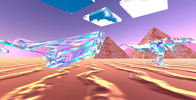
It’s very pretty, sure, but what do dinosaurs in the desert have to do with glitching, futuristic cities?
Unanswered Questions
That all sounds well and good, but there’s no context for it. What are these gameplay mechanics? What are flavorful tools? How does one even begin to comprehend that second paragraph? It almost sounds like getting a quick ending is a good thing.
After the backer rewards and a section on the visuals and music, there’s only an equally vague “Features” section. “Become the most popular user, find the Mainframe of the Internet or jam with the console cowboys in cyberspace.” What does that mean? “Cut down ads with a katana, surf the skies of the net on the e-board or show your love by punching people with the Like fist! Discover a broad range of tools to interact with the World!” U wot m8? There, that’s an internet thing, right? These random lines have no context, and lack any explanation.
As Cliqist writer and longtime Quidditch referee Serena Nelson points out, Broken Reality is sorely lacking a demo. This is the kind of game that already needs a demo to fully understand how it works. Without one, the off-kilter text is left standing alone, flapping in the wind without direction.
The game certainly looks weird, you have to give the developers that. That weirdness is meaningless without an explanation behind it though. Jazzpunk is a great example. It’s got a concrete theme to it: it’s a spoof of 60’s spy stories, and all the weirdness hangs off exploring those clichés like Christmas ornaments on branches.
The Need for Cohesion
In Broken Reality, there is no spine, nothing holding everything together. There’s only the setting of the internet, all of it, as justification for the gameplay, visuals, and story.
There could be a great gem of a game here. Maybe there is an ironclad backbone tying the kooky visuals and gameplay elements together in a deep and meaningful way. None of that is present in the Kickstarter campaign though. Like our copy editor going over my articles, I can’t help but knock back shots and wonder where it went wrong.
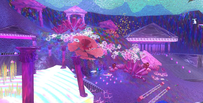
i understand this article is old, but i just wanted to share that i dont think it was the makers of the game intention 2 giv this game a backbone in the first place, or specific motive. based on the free roaming gameplay, i think they aimed 4 it 2 be exactly what ur saying: different and hard 2 understand. I think the game is supposed 2 solely be an experience, not so much sumthing 4 the logical brain. there is a subculture of art/music called “vaporwave”. that is the aesthetic they had designated. and also they made another kickstarter thingy and now hav enough funding 2 completely finish the game by sept 2018, so they hav bounced back.
just wanted 2 share my perception on it. of course different people like different things, but not everything has 2 hav a (definite) answer. sum things just are, they just, be. Thats what this game is about i think. Just being. And sum people dont like that, which is fine.
im not sure what ur views on this r now, or if u even hav any, but yea. Hope u can see where im comin from