There’s a fragile serenity to the opening moments of In Other Waters. Lush ambient electronica announces a swirling, minimalist display of reefs like alien fingerprints. Dark blues and busy yellows color a sleek UI that feels both functional and ornate. There is wonder here, in these alien oceans. Wonder and impossible beauty. But there is something else, too. Something hidden between the numinous echoes and chirping radar. Something terrible, and unknowable.

Scan
“In a future where humanity’s ceaseless consumption has expanded out to encompass the stars, and Earth’s last biological life clings to a poisoned planet, In Other Waters tells the story of Ellery Vas, a biologist who stumbles upon extraterrestrial life.”
Between Technology and Humanity
In Other Waters is a narrative rich exploration game from writer and designer Gareth Damian Martin, editor of Heterotopias and lead designer on The Tower at Tortenna. Playing through the demo, I was immediately stuck by the distinctive interface. There’s a lot I could say about it, but Gareth was kind enough to speak to Cliqist about his design influences, so I figured it would be best to let him do the talking. (It’s a very nice interface)
“I always thought of interfaces, the line that divides humans and technology, as being the core visual of a lot of science fiction. For me, the definitive sci-fi openings are the likes of Alien’s Nostromo startup, 2001 Space Odyssey’s docking sequence or even Under The Skin’s haunting vocal warmup. Each one places the audience in a mid point, between the technology and the humanity, their allegiance and interest not falling on one side or another. As In Other Waters is a game where the player takes the role of an AI, I wanted the interface to be expressive, weighty and characterful. So I turned to these films and to the distinctive tactile weight of 1980s technology and sci-fi to inspire me.”

Secrets
Xenobiology
“Personally I find the prevalence of loose, transient, holographic interfaces in contemporary sci-fi disappointing, they often seem to want to dissapear into a fuzz of complicated shapes. For In Other Waters my aim was clarity without sacrificing complexity, the iceberg like structure of a small window into a larger, complicated machine. 1980s and 90s anime, especially Gundam, was a great reference for this, especially as it sidestepped the industrial grit that is everywhere in sci-fi, focusing on color and shape rather than wear and tear. But while all these influences were important, I also wanted to avoid nostalgia and a throwback aesthetic. So my approach was to try to twin more contemporary signatures like long-shadows and flat colors that we find on contemporary phone operating systems with the ethos of these older sci-fi references. In a way, that captures my intent with In Other Waters – to build something familiar and yet contemporary, to bring the thoughtfulness, the ambition of classic sci-fi to a UI based game now.”
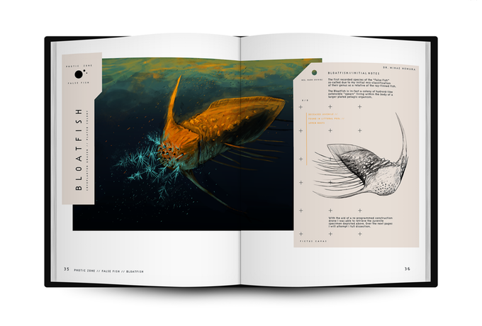
You can check out the trailer for In Other Waters above, and help bring Gareth’s unique vision to life by becoming a Kickstarter backer here. There’s some great rewards on offer, including hardcover copies of In Other Water‘s companion book, A Study of Gliese 667Cc, a fictional charter filled with original artwork and inspired by Wayne Barlowe’s Expedition.


No mate, this is a comments section. Are you lost?