Mindless Box is yet another in a recent string of Kickstarter games that fits the mold of “just okay.” It gets the job done without too many flaws, but is otherwise dull and lifeless. Mindless Box is different though in that its “okay-ness” stems not from a boring idea, but from bad execution.
You wouldn’t get that idea at first glance though. An otome game, Mindless Box is a lengthy visual novel with multiple paths and countless cute boys to ogle, (hashtag, men are objectified too see, SEE!). There are two things that set this game apart though, the first being the spook factor.
Gifted Witches and Wizards
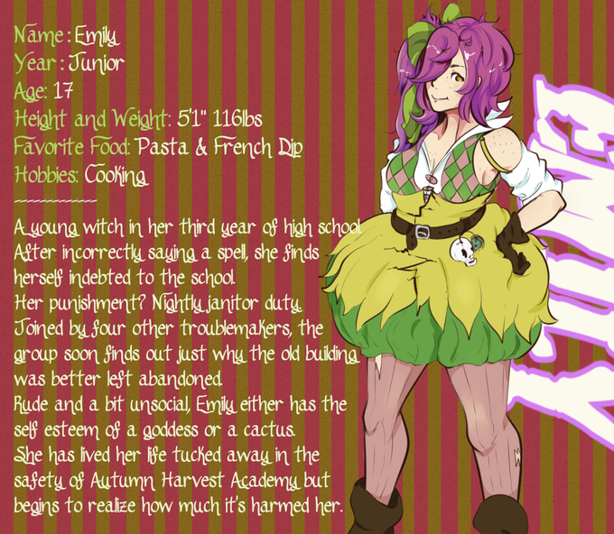
This particular visual novel is Halloween themed, and everything from the character’s outfits to locations are centered around Pumpkin Day. It’s not just a throwaway theme though, as the obligatory high school setting is actually a school for gifted witches and wizards. The player character, Emily, is experimenting with a witches cauldron and accidentally brings the roof down. With no money, she has to pay for the repairs by cleaning dorms at night.
 The second and more important difference is in the story. Mindless Box originally started as a counter to classic tropes of the genre. As a result, choices in the game won’t just boil down to what greased up, impossibly buff teenage boy you end up making out with. You have to think about your choices because they will have far reaching consequences on the story and your relationships with friends, teachers, and other students.
It all sounds great, assuming the lone developer working under the name Gabicho can pull it off. The problem comes when you look at the provided screenshots, and the Kickstarter page itself.
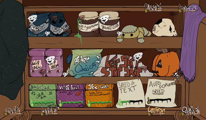
 The character bios are written in a terrible, only one step above Comic Sans font with no shadow or border. The backgrounds are also in horrid, vomit-looking colors. As a result, the text is almost impossible to read. Worse still, this motif carries over to the game itself.
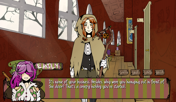
Text is presented in dialog boxes with the same gross background and font choice. It’s important to be able to read a visual novel, and when you can’t, the game is functionally broken. The backgrounds also seem to be just as muddy, soupy, and cluttered. Take the image below. The character model looks good, but what’s going on in the background? Where does one hallway start and another end?

Coming Soon, or Too Late?
This is another campaign that promises a demo is “coming soon,” but with no set date. Why tell people a demo is coming if there isn’t one ready? It would have been better to wait until the demo was ready before launching the Kickstarter.
Other than that, the Kickstarter is solid enough. There’s a lot of information about the game and the developer. A progress report even tells us the status of the game. It’s just that the campaign is so paint by numbers. There could be some interesting ideas here, but without a demo we just have to take the developer’s word for it, that this particular visual novel will be different. Not to mention the text is almost impossible to read, a big deal for any text heavy game.
Mindless Box, like Project Automata or Creekside Creep Invasion, could be a good game. But, like the others, it is just so badly presented, it creates too much of a question and too much of a gamble for my taste.


[…] games centered around Halloween itself are few and far between. We’ve had a couple this year in Mindless Box and Creekside Creep Invasion, but both have their share of […]