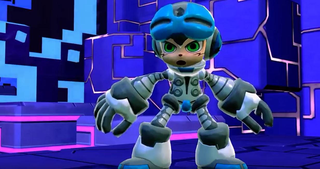
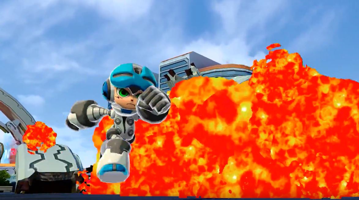
It’s hard to believe a game with as much potential as Mighty No. 9 can garnish so much scorn. A common problem for indie games is inexperience, due to new developers. Mighty No. 9, with its boasts of the leadership of Keiji Inafune and the talent of Capcom veterans, shouldn’t have this problem. Yet the game has been plagued with all the same problems, including delays and backers not getting their rewards. In the latest move by the Mighty No. 9 team, the newly released trailer has gotten nearly ten times as many dislikes as likes. So what exactly went wrong here?
The graphics aren’t up to par with expectations. From a distance and during most of the gameplay shown, they seem passible, but whenever the camera zooms in on the characters’ Ash Ketchum-esque faces I cringe. With the same repetitive gamplay shown over and over, the trailer manages to feel tedious and overly long, even though it lasts less than two minutes. On top of all of that is the narration.
Between the music that felt more at home in 2003 and the cheap explosion effects is possibly the most obnoxious voice over I’ve ever heard. I hate to say it, but the old adage of “show, don’t tell,” could really benefit this train wreck. Don’t tell me “Hey, this game is AWESOME,” show me what makes it a worthwhile experience. To the ad’s credit, combos and power-ups are mentioned, but it doesn’t even feel like the narrator’s heart is into the annoying bragging. If the guy selling this can’t get into the idea of playing, how am I supposed to?
When it comes down to it, if you talk a big game, backers are going to expect a big game. It isn’t surprising that some people were let down when expectations for the game were so high, but it’s a disservice to fans to screw up on so many different levels. Whether the game can live up to its developer’s reputation in spite of numerous missteps still remains to be seen, but the trailer doesn’t inspire much confidence.


Yeah, I think you hit the nail on the head. The game just looks so ugly. Not just the graphics, but the art style. It’s got that cheap, CG, sterile look to it. Like they just generated everything on a computer without putting any heart or charm into it.
And yeah, that voice over is just terrible.
Spot on. Narration makes me want to puke. “Ash Ketchum-esque faces”… LOL!
Ooph, that’s really rough! I understand the original screenshots were just mock-ups, but this doesn’t resemble what was sold at all. Looks like a late 90’s copy-cat action platformer.
The big shit the narrator took on anime fans probably isn’t helping, either.
Was this a rejected PSP game made in the 90s?
you are a reject from the 90’s.
I was quite the rebel in the 90s since I was the black sheep of the group, you’re right.
But yeah, this game looks like trash.
haha nice reply. does it though? looks like mega man. what were anyone expecting exactly?
Well, for starters I guess (Not that I was anticipating it, as much as I grew up with Megaman). Google up mighty no.9 concept art, the style shown in the artwork am sure was, precisely what people wanted. 2D/3D elements with good atmosphere.
concept art is always more detailed and interesting than retail products it is one reason i love buying art books.
Not always, many can also be vague but to paint a ‘bigger picture’ of environment and sizeability, structure, theme, etc. Just, am sure people wanted that artwork to transform into what the game is, a blend of Megaman / New and that style he had made in the artwork.
After 9000 delays, and so much money. We all should be able to see that these visuals, and the gameplay, is not worth $3.8 MILLION DOLLARS. I’ve seen indie studios make ,amy games like this for much less and look less trash. I’ve seen pixelated hentai games with more quality backed behind it and for less. lmao
Saying the game looks like it’s from the 1990s is a huge exaggeration. The game itself doesn’t look too bad, but it’s sort of hard to tell. It’s just the editing, the music, and that horrible, horrible voiceover that really sinks it. Deep Silver needs to do some damage control and put another trailer for this ASAP that doesn’t alienate much of the audience that funded the damn game in the first place.
I love being greeted with a “hey you!”
yeah they should have led with bigshynepo that way we would all know the world revolves around you.
Or just omitted the first two words of the voiceover?
Thanks for trying to give me my 15 minutes of fame tho.
i like that they made fun of anime fans and that anime fans immediately put their fat faces on youtube videos to let their scorn be known like a mad black woman at mcdonalds.
[…] releasing an ill-advised trailer last week for Mighty No. 9, developer Comcept and publisher Deep Silver have released another […]
[…] must say I’m a big fan of it. Compared to another Japanese Kickstarter game, Mighty No. 9, Bloodstained’s art looks alive, beautiful, and vibrant. It looks like an artist laboriously […]
[…] a continuous source of dissatisfaction for backers. Maybe I’m still a little sore from that Anime-fan on prom night comment. However, even before that, we’ve been documenting this Kickstarter’s nose-dive. Watching […]